

The Red Bridge, formerly known as Paint Creek Bridge as it once spanned the tiny creek outside Camden, IN, now sits serenely across the Wabash & Erie Canal in Delphi, IN.
I first fell in love with the graceful arches of this bridge nearly 30 years ago when it still sat, broken and condemned, across Paint Creek. The tiny road leading to the bridge was closed to vehicle traffic at the bridge, and had been for some time. I’m so pleased the bridge was moved, restored and placed across the canal to be enjoyed by walkers and cyclists. AND, I love that they painted it red! Such a beautiful contrast against the natural greens of its surroundings.
To help gain a better understanding of this scene, I began with a small value sketch. It’s about 5 x 7 inches and was created very quickly by squinting at the photo reference and breaking the scene down into just three values. I find it helps to determine the extent of the contrasts within the piece.

Unlike my colored pencil drawings, I do not start pastel paintings with a black background. They color of my paper is insignificant since I will begin with an underpainting, but the U-Art 400 paper I like to use is a light tan/beige color. I started my underpainting by blocking in basic values of the scene with warm tones of gold, purples, and dark pinks.

Once values were blocked in, I used a brush and a little rubbing alcohol to liquefy the pastel and allow it to basically become paint on the paper and cover the entire background in color. I use a very wet brush and don’t mind if it runs and dribbles. Most of the what you see will be covered in layers of pastel and not visible when the piece is finished. The underpainting serves mostly as a foundation for me to start building layers of color and value. It’s the beginning of the structure, the “bones” of the work.

I have two factors to consider when choosing where to start with the layers of color. First are the physical qualities of the work, top/bottom, left/right, and gravity. Yes, gravity. Soft pastels are basically powdered pigment mixed with just enough binder agent to hold the pigment together. When marks are placed on the paper you will have pigment dust that falls down the face of the paper. I prefer to have my paper taped to a drawing board and placed as vertical as possible on my easel. Excess pigment dust will fall down the face of the paper into a collection tray at the bottom. (More on the collection tray in a different post.) So, generally speaking I try to work so that a minimal amount of dust falls on sections of the painting that are completed. Also, I am right-handed so I usually find that working left to right is more convenient.
The second factor to consider when starting a painting is internal depth of the scene you are painting. I find it works best for me to start with element farthest away, in this case the sky, and work my way towards the foreground and the elements closest to the viewer.

Above you will see the sky blocked in as well as the sky reflections in the water and, in the upper right, a few “sky holes” to peak through the trees later. I also started adding the darkest values to form the structure of the trees.

Above and below photos show layers of color added to create and fill out the trees. In most cases, the trees farthest in the background will have a bluish tint, and the trees closer to the foreground will be warmer greens with more yellows.

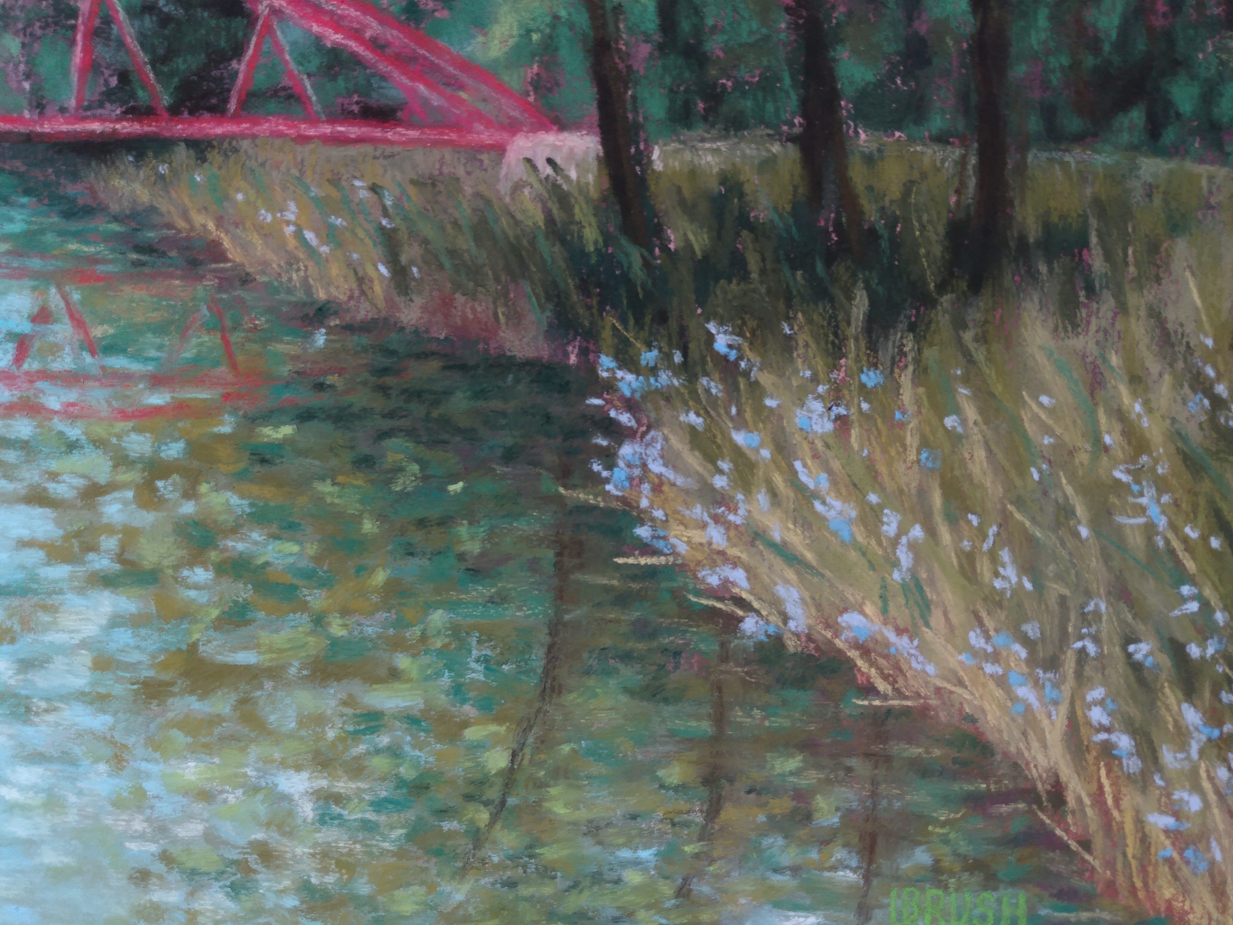
Now it’s time to move on to the water. To be honest, I chose to exercise artistic freedom with the water. In reality, the canal is a very placid waterway. Sometimes almost a glass-like stillness. I wanted a little more movement and texture in the work so I chose to add movement to the water by breaking up the reflections with many small strokes of the pastel.
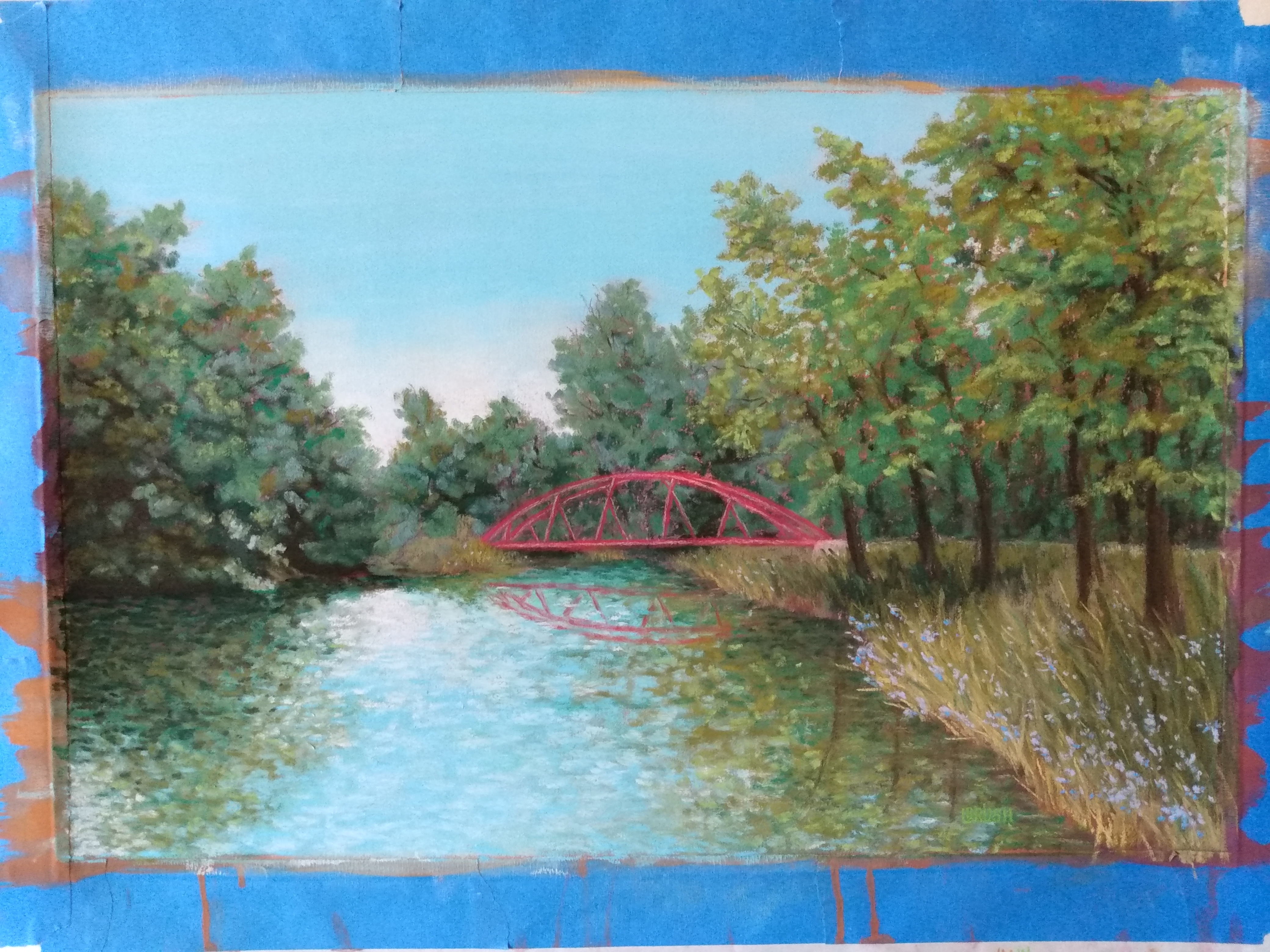

A great deal of time was spent adding details to the bridge, trees and grasses to complete the piece. One of my favorite parts of this piece are the blue flowers along the water’s edge.

Prints of The Red Bridge and products with this image are available on my website at www.lisablissrush.com.
